
At least this part of it does. This is a graph I made of the flux seen from the Earth of a young star with a disk around it. Compared to the star by itself (the blue line), you get a flux excess at longer wavelengths.
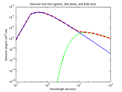
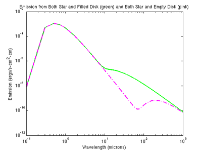
Then, if you start to take away material inside the disk (it starts to accrete onto the star, for example), the excess starts to flatten out, but rejoins the original curve at longer wavelengths – how cool is that?!
It doesn’t work quite like this, because these graphs are for a perfectly flat disk, and actual disks are probably flared, since gravity becomes weaker further from the star, but it’s still neat =)
Ok, I’m a dork. And I won’t do this with all of my homework.
Still sick…
They’re so pretty! ::squeals::
yay it works!
=) I was really surprised it turned out just like it was supposed to, hehe. I guess math works sometimes…who knew..